Sports visualization with Python
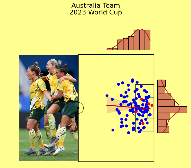
Details of all shots Australia team attempted across their 7-match World Cup campaign. We will
be able to create this visualization by the end of this blog. Original Matildas image is by Sydney.com.
In recent years, the sports world has witnessed a transformative shift. Gone are the days when decisions were solely based on intuition or past traditions. Today, the headlines are filled with the advancements in Sports Analytics. From media outlets highlighting the evolution of this analytical age to advertisements showcasing the latest Big Data tools, the landscape is changing rapidly. It's not just about tracking basic statistics anymore; it's about leveraging multi-dimensional cameras that capture every minute detail, from the speed of a pass to the sweat on a player's brow. Think of the legends of the game - L.Messi, LeBron James, Tom Brady - and imagine the insights we can now derive to optimize their performance further.
While we've made significant strides, the journey of Sports Analytics is ongoing. The field continues to evolve, offering teams invaluable insights that influence decisions on drafting, trading, coaching, and strategizing.
In this article, I won't be delving into predictive algorithms for the Premier League standings or crafting the ideal team composition for the current season. Instead, I'll focus on the power of visualization in sports analytics, showcasing techniques that bring data to life, captivating and educating sports enthusiasts alike.
Where can we get the data? 🤔
Bad news: this is usually the hardest part.
While summarizing sports events might seem straightforward—like tallying goals in a soccer match or counting throws in a basketball game—the real challenge emerges when seeking in-depth, play-by-play data for specific games. Monitoring every move of players in dynamic sports like football or basketball is no small feat.
However, this intricate task holds immense value. Companies like SportVu and Opta Sports have capitalized on this demand, offering these detailed datasets at a premium. Their clients ranges from sports teams and consultancies to research institutions, all eager to access this rich trove of information.
“For every match we have three guys using[…] a live video feed on a pitch graphic: one guy watches the home team, another does the away team and the third man is essentially a data checker”
— Simon Banoub, Opta’s director of Marketing
Here comes our unsung hero
In a recent development, Statsbomb has unveiled their comprehensive, second-by-second datasets. These cover every match from prominent football leagues such as the National Women Soccer League (US), the FA Women’s Super League (England), and the iconic 2023 FIFA World Cup. You can get access to their datasets for free here.
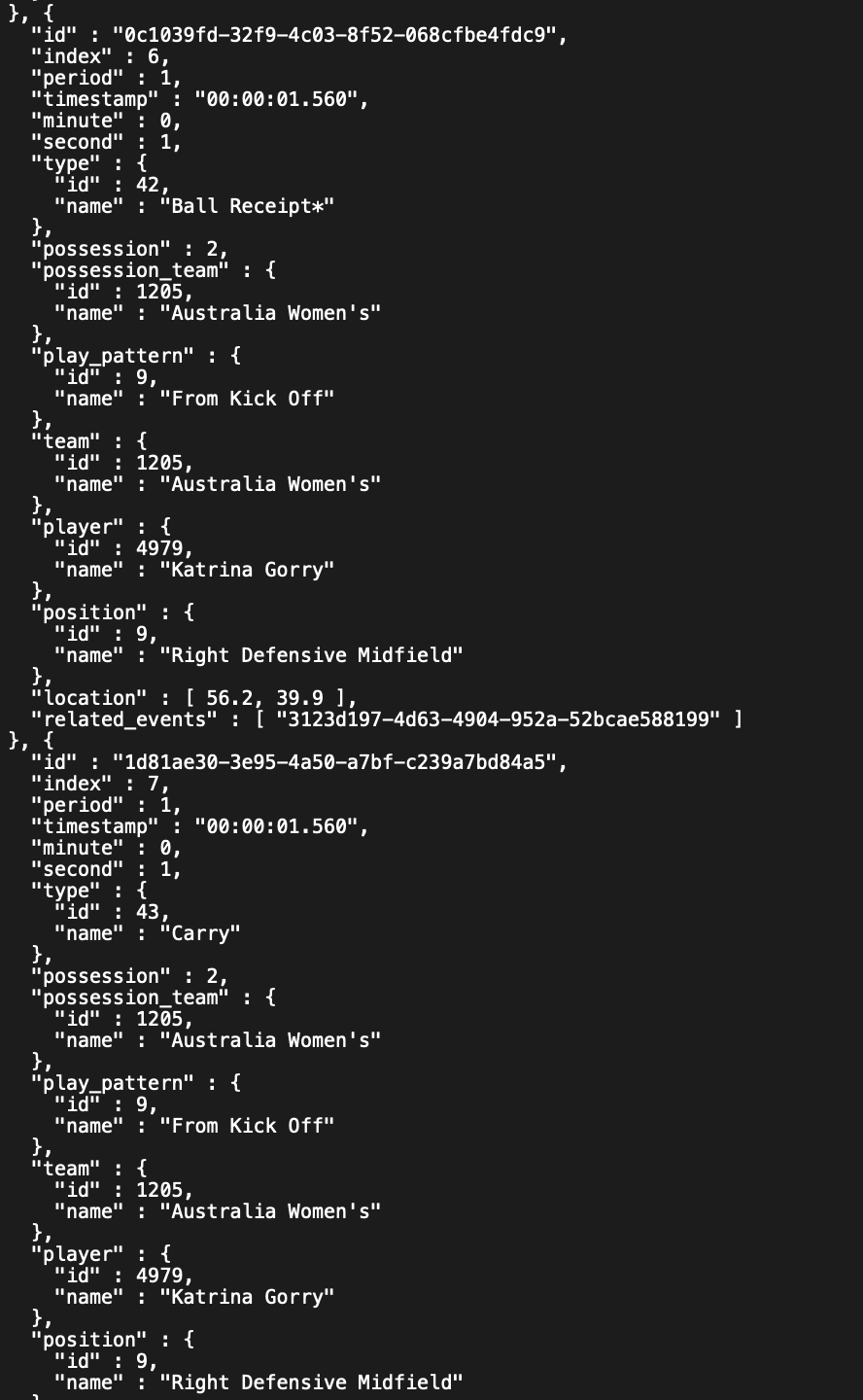
To give you a clearer picture of what this data entails, let's delve into a specific example. Below is a snippet from the dataset, representing a segment of data from a match featuring the Australia Women's vs Republic of Ireland Women's match:
Note: These datasets are provided in JSON format. To make the most of them, you'll need to convert this raw data into a structured format that's more user-friendly and easier to manipulate.
In this guide, our attention will be solely on the 2023 FIFA Women's World Cup.
Initially, we'll utilize mplsoccer to illustrate a basic football pitch for us.
A nice football pitch created by mplsoccer library.
Let's Analyze the Game: Australia Beats Denmark 2-0.

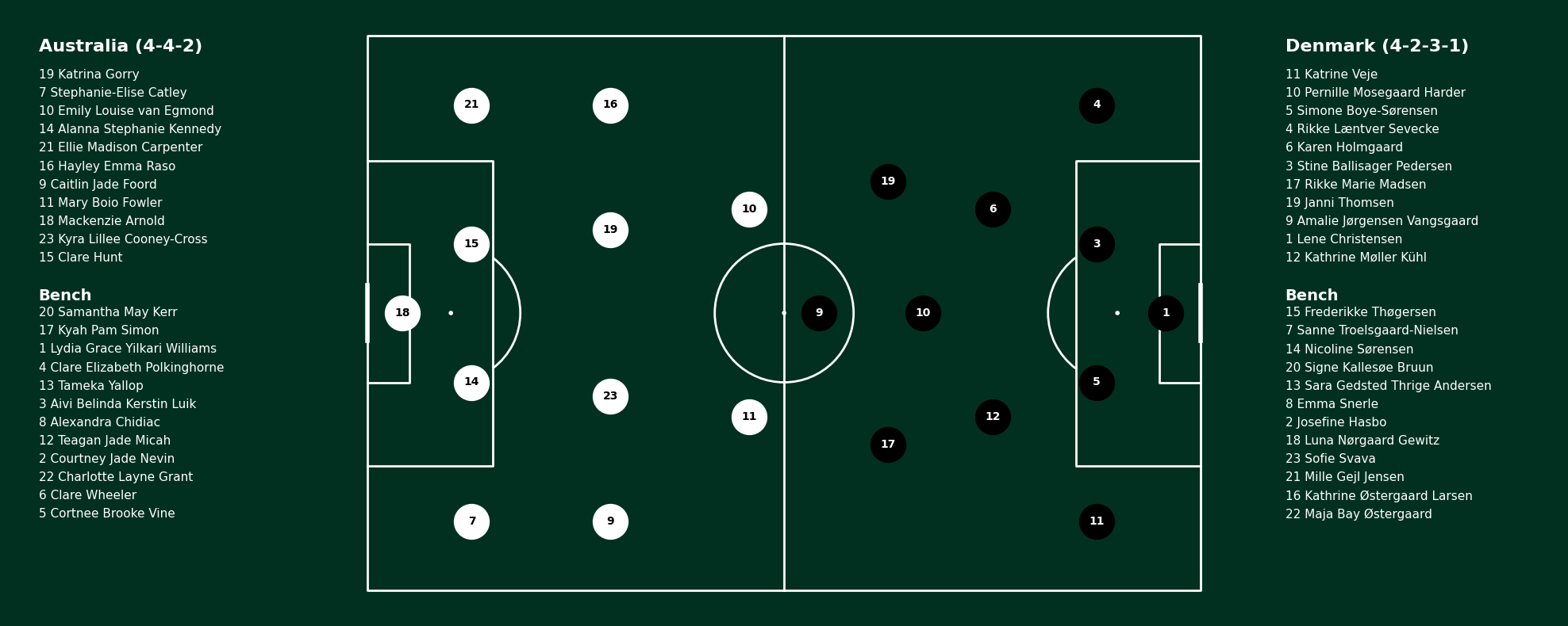
In my attempt to visualize football lineups, I utilized the mplsoccer library to depict the formations of two teams on a football pitch. Let's go into the steps I took:
- Setting Up the Pitch: The pitch is divided into three sections: left for Australia's team information, right for Denmark's team information, and the center for the actual pitch visualization.
- Coordinating Player Positions: Specific coordinates on the pitch were assigned to each player position for accurate representation.
- Player Depiction: Players were strategically positioned on the pitch based on their roles, with their jersey numbers clearly marked.
- Data Sourcing: I extracted the lineups for both teams from a DataFrame and procured the complete squad details for both teams.
- Final Display: With all elements in place, I invoked the
plot_players_on_pitchfunction to bring the visualization to life.
Through these steps, I was able to create a compelling and informative visual representation of the football lineups, highlighting both the formations and individual player positions.
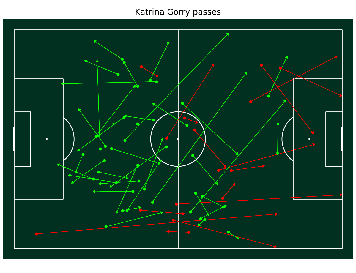
Plotting Pass maps
Now to plot pass maps, we can either plot it for each player separately. I will demonstrate the process to do both.
The process to plot individual pass map of the player is:
- Filter the data by ‘type_name’ as ‘Pass’ and also by the player name. Save it in another data frame.
- Create an instance of class ‘Pitch’.
- Iterate over all rows of events. Get the x and y co-ordinates of the pass origin and then the distance travelled in the direction using the subtraction of pass end co-ordinates and pass start co-ordinates.
- Now within that loop, check if the pass was incomplete or not. Based on that plot it using the ‘arrow’ function with color red or green. We also plot a scatter bubble at the pass start point.
- After the loop, add a title text for the image and display the pass accuracy percentage.
Now, to generate the passing maps of all players of a team, we create a grid of plots and iterate over all players of that team.
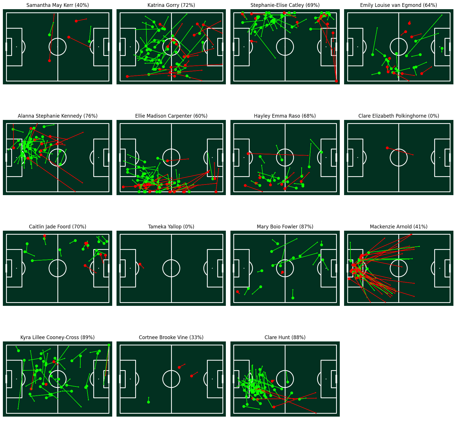
Upon analyzing the squad of the Matildas, it's evident that their tactical approach leans heavily towards playing long balls. This strategy, while effective in certain scenarios, places a significant emphasis on the accuracy of passes. A notable observation is the pass accuracy of their number 18, Mackenzie Arnold, who happens to be the goalkeeper. With a pass accuracy of just 41%, there's a clear area of improvement. Goalkeepers, especially in modern football, play a crucial role in ball distribution and initiating plays from the back. Enhancing Arnold's passing accuracy could drastically improve the team's ball retention and build-up play. If the Matildas can address this aspect and refine their long-ball strategy with better accuracy, they could elevate their game to new heights and pose a greater challenge to their opponents.
Long Shots or Box Shots?
A friend of mine was very convinced that the key to Australia’s successful World Cup was their relentless attempts to break down defending lines with long-range shots. Think about that stunning goal Sam Kerr scored against England in the Semi-finals.
We can again attempt to visualize all shots from the Australia team to decide whether the majority of their goals come from outside or inside the box?
If I just follow the methods shown thus far, this is what I get.
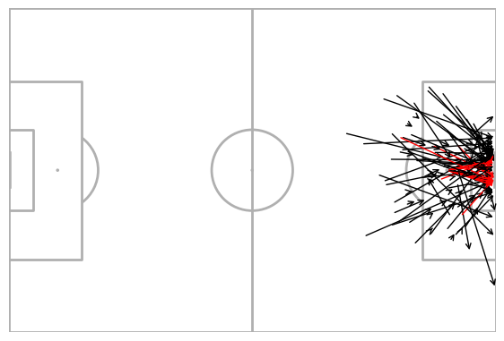
Shot by Australia team during the World Cup campaign.
This is fine. However, there's potential to enhance the visualization to make it more engaging and insightful. To achieve this, I implemented two specific modifications:
- Given that our focus is solely on the shots, which are all documented on one side of the pitch, I've chosen to depict only the right half of the pitch.
- Considering our interest lies in the starting points of the shots, I've decided to omit the arrows. Instead, I'll represent the shots using scatter plots, where the x and y coordinates correspond to the locations where the shots were initiated.
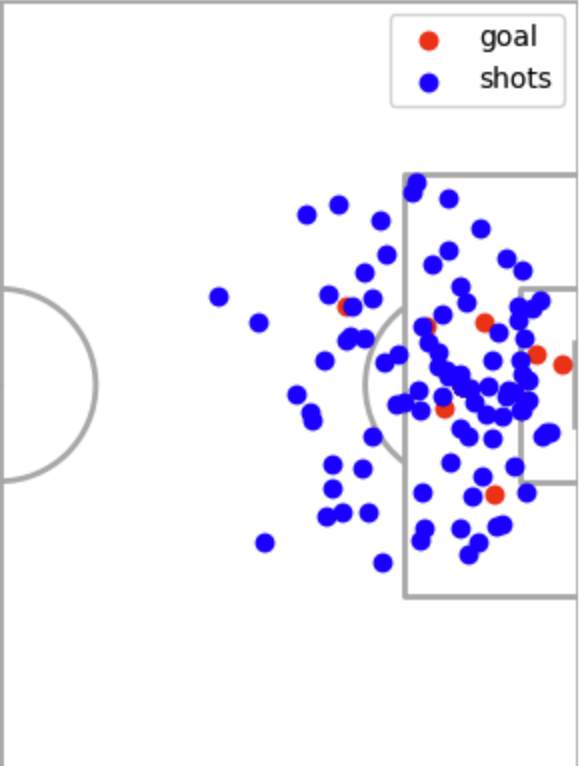
Now, the visualization appears significantly improved. A quick glance reveals that while long-range attempts were indeed a notable feature of their gameplay, the data suggests that the majority of their goals originated from within the penalty box. In fact, the number of shots taken inside the box was double that of outside the box, and more importantly, the success rate of these attempts was significantly higher. The concentration of red dots inside the box—each one representing a goal—clearly outweighs those from further afield. This indicates that while Australia's long-range efforts were eye-catching, it was the precision and pressure applied from closer range that truly underpinned their successful World Cup campaign.
In conclusion, I created this visualization to congratulate the Matildas on their successful 2023 World Cup campaign, by combining a density plot with images to highlight their achievements.
You can find all the source code for this article on my Github.
The data used for this project was released by Statsbomb and is available to the public here.